
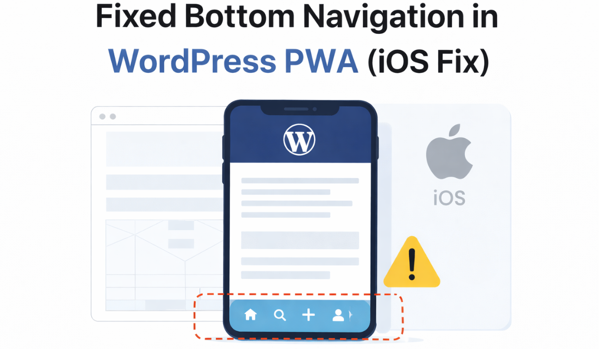
If you’ve tried adding a fixed bottom navigation to a WordPress site running as a PWA, you probably discovered something frustrating.
In normal browser mode everything looks fine. The nav stays fixed. The spacing works. The layout feels stable.
Install it on iOS in standalone mode and suddenly it starts shifting. The safe area overlaps. The viewport behaves unpredictably. Something that looked perfectly fine in Safari breaks the moment the site is installed as a Progressive Web App.
After months of testing, I brought this up in a discussion with other WordPress developers to see if others were running into the same issue. You can see that conversation here:
https://www.reddit.com/r/Wordpress/s/W2psDUC9hP
The pattern was clear. Most developers were applying safe-area padding and viewport tweaks, but very few were addressing the deeper architectural issue.
The problem is not just CSS.
Why fixed bottom navigation breaks in iOS standalone mode
When a PWA is installed on iOS and launched in standalone mode, Safari removes the browser chrome and changes how the viewport is calculated.
The height becomes dynamic. Toolbars appear and disappear. The safe-area insets shift depending on scroll behavior. Even values like 100vh do not reflect the true usable screen height.
Adding viewport-fit=cover is required, as documented by MDN’s viewport meta tag reference:
https://developer.mozilla.org/en-US/docs/Web/HTML/Viewport_meta_tag
You also need to account for safe areas, which Apple explains in its safe area documentation:
https://developer.apple.com/design/human-interface-guidelines/layout#Safe-areas
Most tutorials stop there. They recommend using padding-bottom: env(safe-area-inset-bottom); and assume that solves it.
It does not.
In standalone mode, iOS recalculates the viewport during scroll interactions. If your fixed bottom navigation is tied too closely to your theme’s layout structure, it will shift with those recalculations.
That is why something stable in browser mode becomes unstable once installed.
What I tried before finding the real fix
I started with the standard approach.
I added viewport-fit=cover.
I added safe-area padding.
I switched from 100vh to 100dvh.
I tested sticky positioning instead of fixed positioning.
I adjusted scroll locking.
In the iOS simulator, it looked correct.
On a real device, it broke again.
The simulator does not accurately reflect how touch areas and dynamic viewport changes behave in standalone mode.
At that point I realized I was treating it like a styling problem when it was actually a structural one.
The real issue is where the nav lives
In most WordPress themes, the footer and bottom elements live inside the main content flow. Even if you apply position: fixed, the element is still indirectly influenced by how the theme structures its containers.
If the body scrolls differently than expected, or if a wrapper div controls overflow, the fixed nav is not truly isolated from layout recalculations.
The breakthrough came when I stopped trying to tweak padding and instead changed the injection point entirely.
Instead of placing the bottom navigation inside the theme’s footer template, I injected it globally using the wp_footer hook so it renders independently of the theme’s content wrappers.
That separation matters.
When the navigation is appended outside the main content container and managed independently, it is no longer fighting the theme’s layout structure.
How standalone mode detection plays into this
Another important part of the solution is only activating the bottom navigation when it makes sense.
You can detect standalone mode using the display-mode media query described here:
https://developer.mozilla.org/en-US/docs/Web/CSS/@media/display-mode
In JavaScript, that typically looks like:
window.matchMedia('(display-mode: standalone)').matches
On iOS, you may also check:
window.navigator.standalone
By activating the navigation only when the site is running as an installed PWA or native wrapper, you avoid unnecessary conflicts in desktop environments.
The structural approach that finally stabilized it
The implementation that worked consistently involved:
Injecting the bottom navigation using wp_footer, not inside the theme’s footer.php.
Applying position: fixed at the viewport level.
Accounting for env(safe-area-inset-bottom) inside the navigation container itself.
Adding a spacer element so content is not hidden behind the nav.
Dynamically applying bottom padding to the body equal to the navigation height.
Managing scroll behavior so the nav does not jitter during viewport recalculations.
Once the navigation was separated from the theme’s internal structure and spacing was controlled at the body level, the instability disappeared.
The difference was not cosmetic. It was architectural.
Why most WordPress builders do not want to rebuild this
To implement this manually, you have to understand:
How WordPress hooks work.
How scroll containers are structured.
How iOS recalculates viewport height.
How safe-area insets behave in standalone mode.
How to manage dynamic spacing without breaking layouts.
That is a lot of low-level debugging for something that should feel simple.
Most WordPress builders are focused on building client sites, not reverse engineering iOS viewport behavior.
Why I built a plugin to handle it
After solving this repeatedly, I built a lightweight WordPress PWA plugin that handles the entire structure.
It injects the navigation properly using footer hooks.
It activates only in PWA or native contexts.
It manages safe-area spacing correctly.
It adds layout compensation automatically.
It keeps everything isolated from theme-specific layout quirks.
The goal was not to add another bloated feature plugin.
The goal was to remove months of frustration for WordPress builders trying to achieve native-style bottom navigation in a PWA.
If you are comfortable implementing the structural approach manually, you can absolutely do it.
If you are not, the plugin handles it without hacks or endless CSS adjustments.
Final thoughts for WordPress builders
If your fixed bottom navigation keeps breaking in your WordPress PWA, the issue is probably not your CSS skills.
It is about injection point and layout isolation.
Standalone mode changes how iOS calculates the viewport. If your navigation is tied too closely to your theme’s content structure, it will behave unpredictably.
Once you separate it properly and manage spacing at the global level, the instability disappears.
That is the difference between fighting the viewport and controlling it.


